Case Haus 37 :
A Mid-Century Modern Revival in the Pacific Northwest
When Lara White and her partner, Jason Stamp, stumbled upon Case Haus during a walk through their neighborhood, they couldn’t resist the opportunity to make this 1957 home, designed by Portland architect Bud Oringdulph, their own. Filled with potential and mid-century modern charm, Case Haus underwent a thoughtful renovation under the care of Lara and Jason, honoring its original architecture while incorporating modern touches.
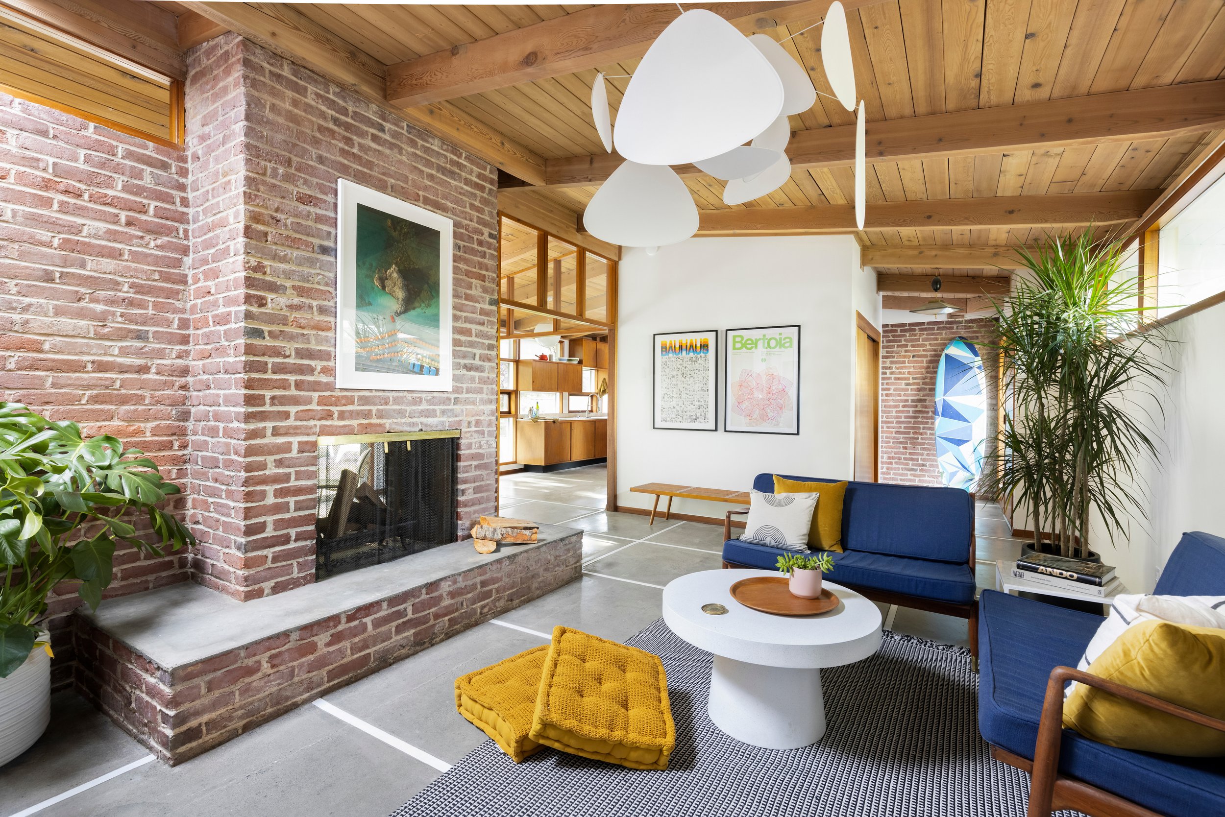
Inspired by the home’s smart layout, indoor/outdoor living focus and well-made 1950s elements, Lara and Jason repurposed and reused as much as possible from the home’s original design. Key elements like the original 1957 cabinets and the cast iron tub were restored, while the ceilings were sandblasted to reveal beautiful natural wood. Lara and Jason also added a personal touch to the space, adding skylights, a vaulted bathroom ceiling, and a hand painted mural in the living room, maintaining a strong connection to the outdoor spaces and giving the home an adventurous edge.
We talked to Lara about their dream of owning a mid-century home, their vision and future plans for Case Haus and the important place Case Haus plays in the Portland architectural community.
Case Haus showcases how small, purposeful spaces can offer an effortless living experience, turning homes into tranquil oases. The project highlights the value of reusing materials, preserving mid-century architecture in Portland and inspiring future designs to embrace simplicity and sustainability.
Text & Imagery by: Meagan Larsen & Annika Bielig-Bussmann & Lara White
What was the primary design concept behind Case Haus, and what inspired it? When we got our hands on this 1957 mid-century modern originally designed by Portland architect, Bud Oringdulph, we knew it had an abundance of potential. The key to a good renovation is to know what to keep and what to update. That was our constant guide, asking, “What will enhance the design that is already here and allow us to bring in our own touches and modernize in a respectful way?”
An example of this is how we saved and restored the original 1957 cabinets because they were still in great condition, and the unique design is one of the main things that drew us to the house. The kitchen had cork-looking laminate floors that we took out and refinished the concrete slab below, and we updated the lights with oversized retro feel lights from @schoolhouse. The ceilings had been stained a drab green that really darkened the space, so we sand blasted the ceilings to bring back the warm, natural wood. The big thing we did was we added two large skylights—one in the living room and one in the kitchen/entry area. This really changed the feel in the house dramatically, flooding the home with light even in the dreary winter days.
How did you come across the property for Case Haus, and what factors influenced the decision to renovate it? We came across this home during the early days of Covid. When there wasn't much else to do, we would go on long neighborhood walks. Much to our surprise there was a whole mid-century modern section of our neighborhood that we had never really seen before. On one of those walks, we said to ourselves, “Wouldn't it be so amazing to buy one of these houses someday?” A few months later we saw one go on the market, and we jumped at the opportunity. The house had some pretty major damages from a leaking roof and burst radiant floor pipe that we needed to take care of, so we wrote to the seller (back when that was allowed) and convinced them we were the right ones to bring the house back to its original glory.
Was the property initially intended to serve as a rental or a residential living property, and how did this intention shape the design and renovation process? We have dreams of living at this property someday; however the durability and utilitarian design really lends itself to being a great rental. So, while we went back and forth at first, we decided pretty early to approach the project as a rental for the foreseeable future. This influenced our design decisions only slightly—mainly, in making sure we kept with durable materials and also allowing us to be a bit more playful with some of the design choices, like the mural in the dining room.
Could you elaborate on the strategies employed to seamlessly integrate indoor and outdoor living spaces in Case Haus? Mid-century homes are so lovely because of the approach they had to indoor/outdoor living. This home is very much oriented to keep the inhabitants’ focus towards the back yard. You can see the yard from almost every space of the house, and the other rooms that are more oriented on the public side of the house have higher windows that give you framed views of the trees and sky opposed to the street. This makes the home feel incredibly private and tranquil.
We enhanced this by adding the two large skylights in the kitchen/entry and living room. We also took the lid off the main bathroom ceiling, revealing the vaulted wood ceilings and another large angled window to let even more light to wash the space. We also renovated the old pool house. The pool was removed years before we purchased it, unfortunately, so we made this semi-attached space into a studio with its own full shower and kitchenette. We wanted it to have the same connection to the yard as the other parts of the home, so we put in a large slider in the bedroom area.
What considerations were taken into account when selecting materials for the renovation of Case Haus? Where did you source most of your design elements and building materials? Durability was the main consideration. However, we also really love working with Zia Tile, and they have really amazing concrete tiles that we used in the shower. Concrete is arguably not as durable as, say, a porcelain, but when sealed properly it works great, and we just loved the look so we went for it. Otherwise, the only other area that we needed to source materials for was the new bathroom in the studio. Here we went very affordable and durable, wrapping the entire bathroom in 1x1 sheets of Daltile Crossville collection, which carries the retro feel into the new space.
How did sustainability factor into the material choices and overall design approach? Reuse! Things in the ‘50s were built very well, so we reused as much as possible in this home. For example:
For the cast iron tub in the bathroom, we had a custom color epoxy made and coated it to match the new design and give it a fresh, clean look.
The old cast iron sink in the pool house was a fun shape and still in good condition, so we just got a new modern matte white faucet.
We kept a lot of the old lights and just cleaned them up to keep with the retro vibe, along with all the original cabinetry.
Were there any challenges or limitations encountered when working with these original features, and if so, how were they overcome? One limitation we have encountered (and still have not come up with a great solution for) is that the 1957 kitchen doesn't have a refrigerator integrated into the design. Furthermore, the open floor plan doesn't give a clear place to put one. Also, we would love to find a way to add a powder room; however this becomes very restricted with the radiant floors.
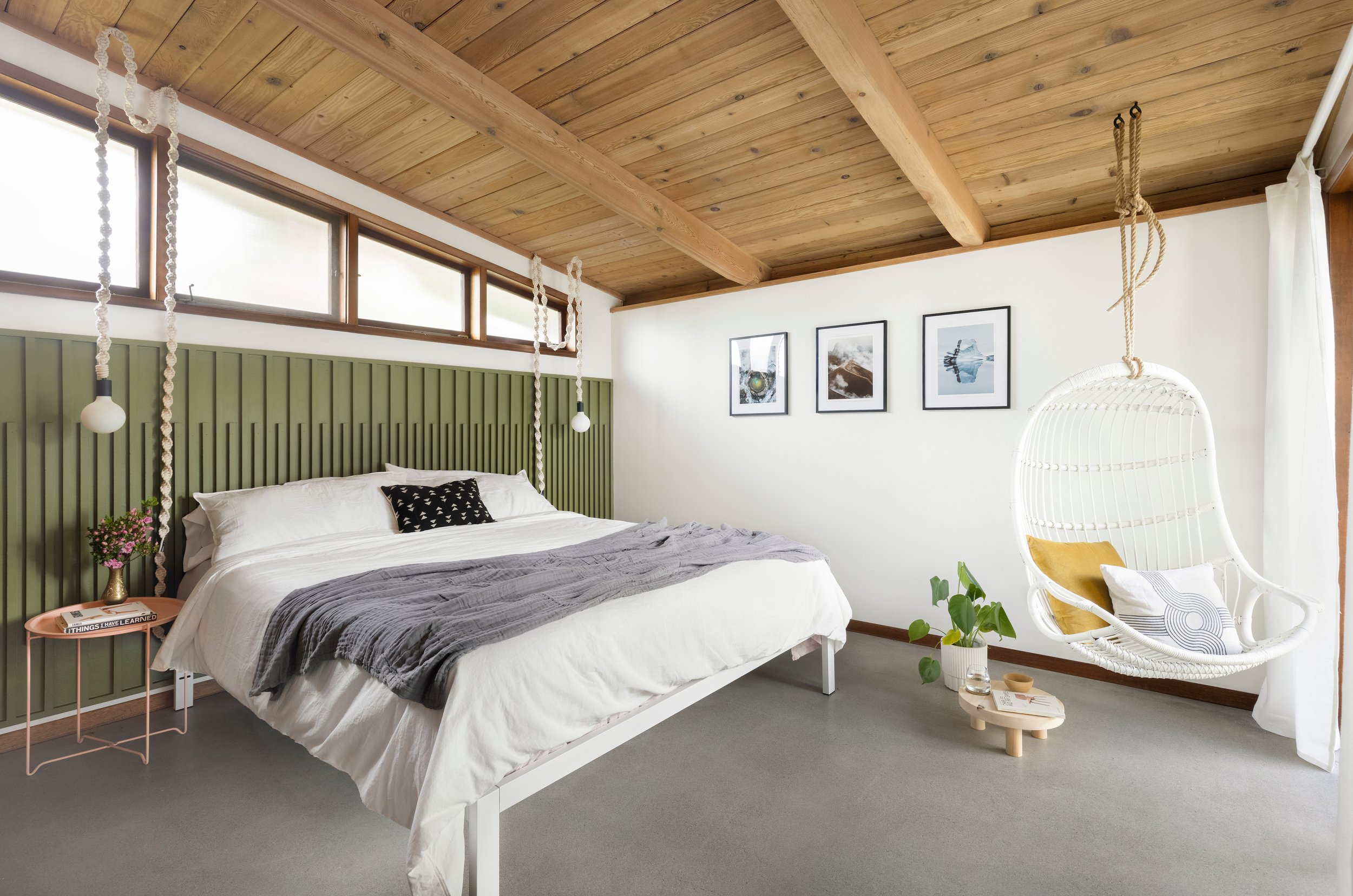
How do you approach the use of colors in interior spaces, and what role do they play in enhancing the atmosphere and mood of Case Haus? Our approach to color is usually to keep the overall palette very neutral and warm and then find select locations to bring in color. Case Haus is probably one of our more adventurous projects with color. We looked at retro color pallets and brought in touches of drab green, dusty pink and ochre in places like the headboard in the primary bedroom and mural in the dining room.
Who created the mural in the living room of Case Haus, and what was the inspiration behind it? Can you discuss the collaboration process involved in incorporating this artistic element into the overall design of the home? I made the mural in the living room. I knew I wanted to brush up on my artistic side and take a minimal risk—it’s only paint—but also have some fun with that big empty wall in the dining room. I wanted to follow the angle of the vaulted ceiling and also add some softness with curves. The process was just a series of taping the straight lines and old-school sting and pencil, then free hand paint for the curves.
Can you discuss some of the innovative design solutions implemented to maximize functionality within the limited space of Case Haus? The functionality was luckily already in place with the smart mid-century design. The layout of the home just makes sense. There is storage in all the right places…not too much and not too little. Large closets in the entry, every bedroom, and linen closets. The house is not large, but the vaulted ceilings, windows and glass transoms dividing the different living areas visually but not physically makes the home feel spacious.
Reflecting on the completed project, what do you believe is the lasting impact of Case Haus on its occupants and the architectural community?
I think it would be three main things:
Keeping things simple and small is often the best way to go. This home doesn't have bells and whistles and is only 1,460 square feet, but it just works. Life feels effortless in the space. You flow from one room to the next with purpose and ease.
When you frame your living environment to the outside and are thoughtful to the views you create, your home can become an oasis.
Reuse! There are so many opportunities to reuse things. It not only often saves money but gives character. They are often made better than new things today, and we can save things from the landfill.
How does Case Haus contribute to the legacy of mid-century architecture in Portland, and what do you hope it inspires in future design projects? We are so happy that we were able to restore and preserve this home (designed by a local architect). It probably would have been torn down to build two homes in its place had it been purchased by a developer, as it sits on a large corner double lot and does not fit the modern idea of needed square footage in a home. Hopefully people that get to experience this home take away a new sense of what's possible in a home and the way we live.


